Earlier today I did a post titled "Facts can be Misleading" and another on "Spurious Correlations". This continues the theme on ways that data can lead you in the wrong direction. The following graph is from The Economist:
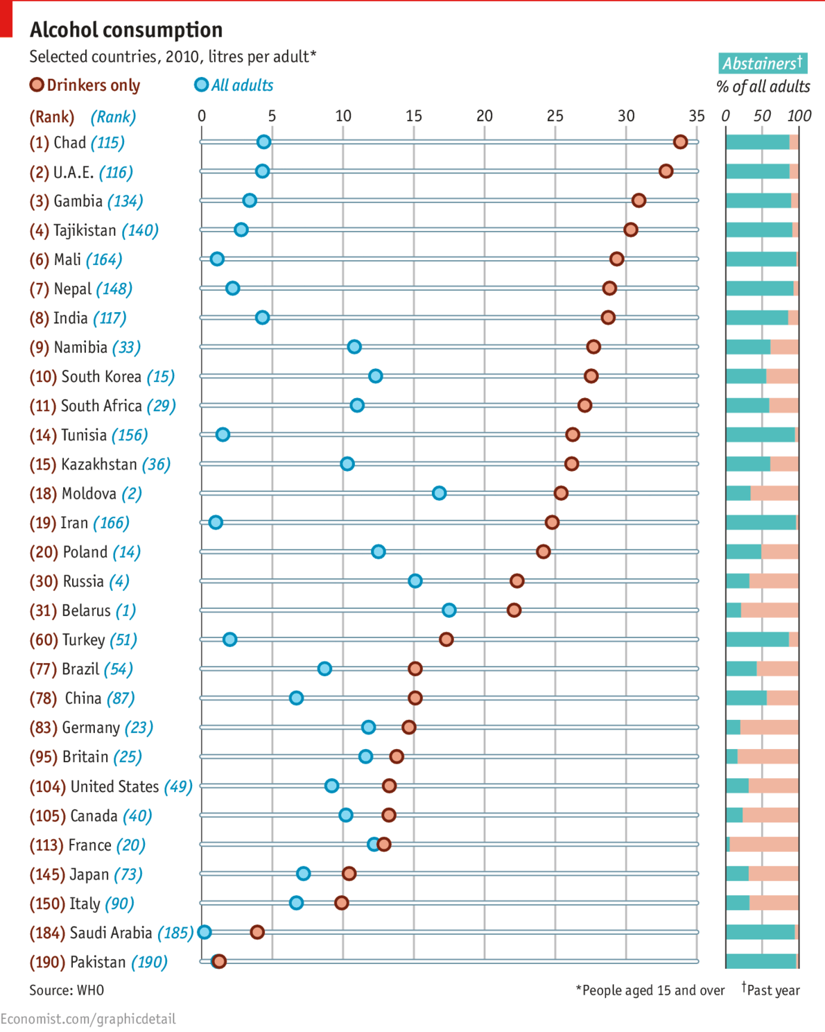
TO JUDGE by national averages, Belarus, Moldova and Russia are the biggest drinkers in the world, quaffing between 15 to 18 litres per adult annually, according to the World Health Organisation in a new report. But those figures only tell part of the story. Not everyone drinks. When abstainers are excluded the national averages look extremely different. By this measure, it is in Africa, Asia and even the Middle East where actual drinkers quaff the most. In Chad almost nine in ten adults abstain, yet its 780,000 drinkers put away almost 34 litres of alcohol each. On the usual ranking, it would come 115th out of 190 countries. France drinks a lot, but because it has one of the lowest rate of abstainers at just 5%, it ranks 113th compared with 20th.The problem of excessive alcohol consumption (as seen by public health officials) is different where a small portion of the adult population drinks to access and the majority abstain, than where a large majority of the population all drink relatively moderately, than where drinking is both wide spread and often to excess,

No comments:
Post a Comment