Showing posts with label indices. Show all posts

Tuesday, June 09, 2015

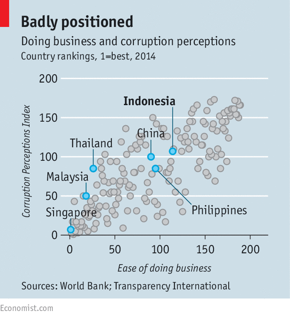
Correlation Between Corruption and Ease of Doing Business


Source: The Economist
I am posting this not because of the data highlighted by the original authors on Asian countries, but rather on the strong correlation shown between the perception of corruption and the ease of doing business. Correlation is not causality, and I assume that there is some deeper cultural cause of both corruption and difficulty of doing business in a country,

It would be interesting to do a Gapminder on this and see how the position of countries changes on these two dimensions in recent history, and relate that change to economic development.

Sunday, April 26, 2015

The USA ranks 15th in the 2015 report


Source of the map
Check out the 2015 World Happiness Report. It is based on a new idea -- that the happiness of the people in a nation is as important as the country's GDP, and worthy of government and citizen attention.

Wednesday, February 18, 2015

The Easiest and Hardest Places to Live in the USA


Source: The New York Times
I quote extensively from the article in The New York Times (go to the original for the interactive map):
(The map is based on) six data points for each county in the United States: education (percentage of residents with at least a bachelor’s degree), median household income, unemployment rate, disability rate, life expectancy and obesity. We then averaged each county’s relative rank in these categories to create an overall ranking........ 
The 10 lowest counties in the country, by this ranking, include a cluster of six in the Appalachian Mountains of eastern Kentucky (Breathitt, Clay, Jackson, Lee, Leslie and Magoffin), along with four others in various parts of the rural South: Humphreys County, Miss.; East Carroll Parish, La.; Jefferson County, Ga.; and Lee County, Ark........ 
Six of the top 10 counties in the United States are in the suburbs of Washington (especially on the Virginia side of the Potomac River), but the top ranking of all goes to Los Alamos County, N.M., home of Los Alamos National Laboratory, which does much of the scientific work underpinning the U.S. nuclear arsenal. The lab directly employs one out of every five county residents and has a budget of $2.1 billion; only a fraction of that is spent within the county, but that’s still an enormous economic engine for a county of just 18,000 people. 
Here are some specific comparisons: Only 7.4 percent of Clay County residents have at least a bachelor’s degree, while 63.2 percent do in Los Alamos. The median household income in Los Alamos County is $106,426, almost five times what the median Clay County household earns. In Clay County, 12.7 percent of residents are unemployed, and 11.7 percent are on disability; the corresponding figures in Los Alamos County are 3.5 percent and 0.3 percent. Los Alamos County’s obesity rate is 22.8 percent, while Clay County’s is 45.5 percent. And Los Alamos County residents live 11 years longer, on average — 82.4 years vs. 71.4 years in Clay County.
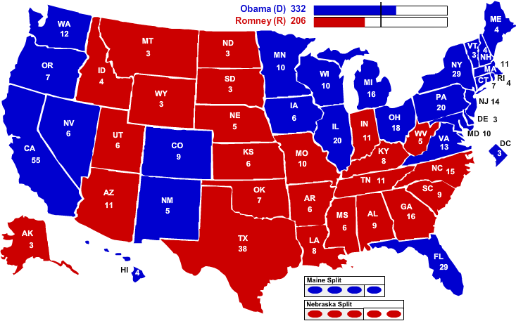
The poorest parts of the country are the old south and Appalachia. The California coast and the eastern seaboard do well. I note that there is a big blue area (doing quite well) in the northern mid-west, what I think of as the agricultural heartland of the country. The orange areas included in that blue are likely to have large Indian reservation populations. The counties there are big, suggesting that when they became states they were sparsely populated, and I suspect they still have relatively few members of the House of Representatives per Senator. These would be Republican heartland (see map below), benefiting from strong government support for agricultural interests.
I am not sure that the poor counties of the south are natural political allies for the better off counties of the Dakotas, Nebraska, Montana and Wyoming.

2012 Presidential Election Results


Saturday, January 24, 2015

What do those comparative wealth news reports really mean.


Credit Suisse's Research department regularly publishes a report on world wealth. (Here is the website of the one for 2014.)
Credit Suisse's 2014 Global Wealth Report reveals a rise of 20.1 trillion US dollars in world wealth in the past year, bringing total wealth to 263 trillion. The United States has seen particularly strong wealth creation, where financial crisis losses were trumped in a single year. Watch the video to find out more.
This is the source for news reports, such as:
Of course, the basic point is clear -- lots of people are poor and some people are very poor. However, the specific meaning is often lost for the sake of a headline.

It is often a very good idea to borrow money. It is a good idea if you can invest that borrowed money in a way to earn enough to pay it back, pay the interest, and take a good profit on the transaction. The people who borrow in this way tend to be those whose capital is greater than their debt -- who have a positive net worth.

On the other hand, debt bondage is a huge burden for many of the world's poor; these are the folk who are in debt and spend years or their whole lives scrimping from their tiny earnings to try to avoid falling deeper into debt. The people who borrow this way tend to have more debt than capital -- who have negative net worth.

Think about listing all the people in the world in increasing order of net worth, starting with those with the most negative net worth. If you were to sum down the list accumulating a cumulative value, that cumulative value would become more and more negative until you finally got to those with zero net worth; you would have to go considerably further -- summing as you went -- before the cumulative value would reach zero. Thus a large portion of the people on earth taken together own no more than they owe.  This is the fact behind the headlines.

A relatively few extremely rich people -- Bill Gates, Carlos Slim and their peers in affluence -- have net worth in the tens of billions of dollars. You have to go a long way down the list described in the previous paragraph to get a sum of net worth equal to the net worth of the richest 80.

There are more than 7 billion people on earth. Thus the one percent includes 70 million. If you look at the total net worth of the 70 million people who have the greatest net worth, that is a huge sum. It is sometimes estimated to equal the total net worth of the other 99 percent of the earth's people.

Sunday, January 18, 2015

Global Mapping of an Unusual Health Indicator


Source
The data comes from the Global Burden of Disease study.

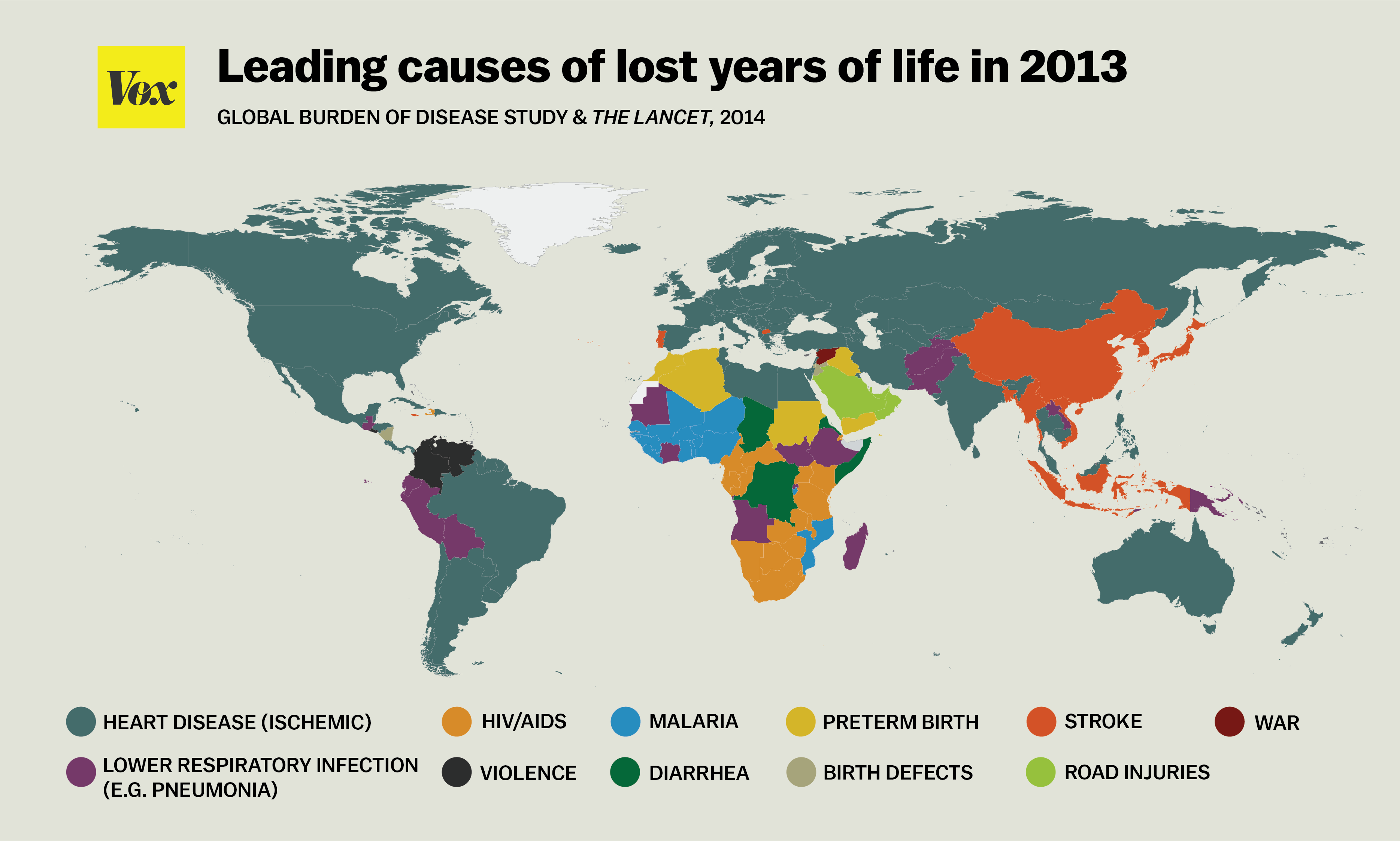
Years of lost life is an alternative index of disease to the more traditional mortality rate. It recognizes that when a disease kills a child rather than an old person, more years of life are probably lost. Thus when a child dies of diarrhea, pneumonia or malaria, more years are lost than when an old person dies of heart disease or stroke. Thus you can infer from the map above that survival rates are better in more affluent countries than in Africa -- something that we already knew. The map does suggest where public health programs might most usefully focus in different countries.

Tuesday, January 13, 2015

Ranking Economists


Souce: The Economist magazine
RePEc rank is the rank of economists as measured by the number and impact of their papers in the professional literature.
The Economist asked Appinions, a startup that analyses influence online, to look at a list of 500 economists—the 450 atop the RePEc list, plus some we chose ourselves. Appinions tracked how much attention was paid to their utterances in the mainstream media, the blogosphere and in social media over a 90-day period up to December 11th 2014. That produced an alternative influence ranking (see table).
Jonathan Gruber, a health economist, received a lot of attention in the last months of 2014 when the media announced that he had been an important player in the design of Obamacare and that he believed it had been misrepresented.  It turned out he had played a role, but not as important as the media implied, and he later retracted the charge. He is a serious economist with a decent professional representation, who perhaps has had his 15 minutes in the media spotlight.

Paul Krugman is that rare bird -- a public intellectual, with a Nobel Prize in Economics and a widely read and influential column in the New York Times.

Many of the other people listed are newsworthy mainly because of their current or former positions on important economic policy boards; their public statements indicate economic policy of interest to the media. Not surprisingly, most of these are also highly ranked according to their professional publications -- we look to serious economists to make public policy.
Economists whose work has come to define public debates do well, too. They include Thomas Piketty, author of a bestselling book on economic inequality; Larry Summers, who has been warning of the risks of “secular stagnation”; and Robert Shiller, an authority on financial-market instability.
Daniel Kahneman is also a Nobel Laureate in Economics for his seminal work on the psychology of economic decision making -- work that justifiably has won him a high ranking for his contributions to the professional economic literature. He has a relatively recent and very popular book out explaining a theory of the brain and decision making, and his theories are generating a lot of media interest.

The point I would make is that different indicators may appear similar, but may actually  do quite different things. RePEc is good for measuring the visibility of economists in the professional literature; it is not equally good for predicting the impact of economists in the more popular media during a relatively short period of time.

I find it relatively reassuring that so many of the economists quoted by the media do in fact have strong professional credits justifying that attention.

Friday, December 26, 2014

On the measurement of development progress


There is an article in the year's end (double edition) of The Economist on the measurement of development progress. The article suggests that the oft used measure of increase in Gross Domestic Product (GDP) is difficult to measure, and presents difficulties in international comparisons. More to the point, many feel that it does not capture the goals of social and economic development well. One important alternative is the UNDP's Human Development Index. While this seeks to combine economic production, education and health, I find it too suffers from failing to capture fully what development is all about. The article notes:
In recent years many have instead focused on happiness. The United Nations has been publishing an annual “World Happiness Report” since 2012. The British government measures “personal well-being” across the country on an annual basis. Yet happiness has its own shortcomings, argues Martha Nussbaum of the University of Chicago. 
Happiness notably suffers as an indicator in that "People are prone to what philosophers call 'adaptive preferences', meaning that they may fail to report their 'true' happiness." Moreover, the individual's view of "happiness" may focus on a hedonistic concept, and may not reflect the philosopher's more nuanced view.

The author of The Economist article cites a 1999 article by William Easterly which is sufficiently important that I quote its Abstract in it entirety:
A remarkable diversity of indicators shows quality of life across nations to be positively associated with per capita income. At the same time, the changes in quality of life as income grows are surprisingly uneven. Either in levels or changes, moreover, the effect of exogenous shifts over time is surprisingly strong compared to growth effects. This paper reaches this conclusion with a panel dataset of 81 indicators covering up to 4 time periods (1960, 1970, 1980, and 1990). The indicators cover 7 subjects: (1) individual rights and democracy, (2) political instability and war, (3) education, (4) health, (5) transport and communications, (6) inequality across class and gender, and (7) “bads.” With a SUR estimator in levels, income per capita has an impact on the quality of life that is significant, positive, and more important than exogenous shifts for 32 out of 81 indicators. With a fixed effects estimator, growth has an impact on the quality of life that is significant, positive, and more important than exogenous shifts for 10 out of 81 indicators. With a first-differences IV estimator, growth has a causal impact on the quality of life that is significant, positive, and more important than exogenous shifts for 6 out of 69 quality of life indicators. The conclusion speculates about such explanations for the pattern of results as: (1) the long and variable lags that may come between growth and changes in the quality of life, and (2) the possibility that global socioeconomic progress is more important than home country growth for many quality of life indicators.
Economist Easterly is an important economic theorist, and I find his use of a wide variety of indicators (grouped into seven sets) to be interesting. I find the suggestion that development progress is not uniform and is affected by external factors to be intuitively appealing,

The Economist article also cites the ideas of Amartya Sen who
argues that “capabilities” are the way to go. The definition of a capability is a bit fuzzy: at its simplest, a capability is something that people have reason to value. The list of potential capabilities is endless: the opportunity to live a long and healthy life, the freedom to take part in political life or to be well nourished. Capabilities, says Mr Sen, are ends that economists should strive to maximise: income is just one of the many means by which we get there.
I think that the development community is irrevocably committed to using a variety of indicators to measure different aspects of social and economic development. I rather like the idea that individuals ought in a liberal society to have the right to choose how best to balance among the different objectives. Who am I to tell the philanthropist who chooses to give away wealth to do good, or the business man who chooses to acquire wealth in the process of producing goods and services, or the government official who chooses a bureaucratic career assuring a level playing field under rule of law that their choices are better or worse than those of others.

At the public level, I rather like the idea of a number of constraints -- that the society should be operating in such a way that a level of health and/or health services should be assured, that a level of intellectual development and/or educational services should be assured, that a level of income should be assured, etc. There could be a debate on the trade-offs -- how much health service would the society be willing to trade off for how much social safety net, or how much schooling? Constraints in this sense would be minimum values, and presumably people would be pleased if some benchmarks were exceeded as long as it were not at the expense of others constraints that were not met.

Tuesday, November 11, 2014

Measures that matter -- for international comparisons


I quote from an article in The Economist (which is also the source of the above chart):
(P)erformance indices, which rank social issues or policy outcomes in different countries by combining related measures into a single score for each, are enjoying a boom. Their number has soared over the past two decades (see chart). For many issues, rival indices must now battle it out...... 
The best indices are meticulous (PISA, for instance, combines dozens of carefully standardised sub-measures and raises statistical caveats). But others are based on shaky figures that are calculated differently in different countries. And choosing what to include often means pinning down slippery concepts and making subjective judgments. An index of democracy, freedom or happiness means putting hard numbers to the fairness of elections, weighing civil liberties against economic rights, or deciding how much to rely on surveys.
The article goes on to discuss work by Judith Kelley of Duke University and Beth Simmons of Harvard University on the Trafficking in Persons (TIP) index "first published in 2001. That year’s annual report covered 79 countries; it now ranks almost 190." The publication of the index data is described as having influenced countries to pass laws against trafficking, but the report as suffering from difficulty in accurately measuring the numbers of persons trafficked.

Of course, the indicators and reports are not of uniform quality. Some, such as the OECD’s Program for International Student Assessment (PISA), which rates 15-year-olds’ academic performance in dozens of countries, are very good indeed. Others require a fairly high degree of sophistication to properly understand and utilize.

Indicators are hard work! It is hard to choose an indicator that is measurable, for which the measurements will be reasonably accurate, that will be policy relevant, and that will be reasonably well understood by the policy makers who are to use the data.

  • GDP, for example, leaves out the product of unpaid services (such as those done by family members in the home) and can be very inaccurate in measuring the product of the informal economy, and even less so in measuring the product of illegal activity.
  • Employment is difficult to interpret as one deals with people who want jobs but are too discouraged to actively seek them, people (such as retirees) who would work if approached with the right jobs but who don't respond that they want work, people who work part time (especially in more than one job), and people who work in the informal economy, in subsistence agriculture, and in the illegal economy.
  • Health: while WHO has promoted the use of disability adjusted life years (DALYs), I don't think it fully captures the burden of illness, nor is fully useful as an instrument for policy makers.
  • Happiness has been experimented by some countries and researchers, but has obvious problems, especially in comparing one cultural group against another (say a phlegmatic group versus a vocally complaining group).
One wants indicators to be used consistently over time so that policy makers can see the overall trends and understand the impacts of their policies; one also wants to update indicators to take advantage of improved theory, understanding, and data collection methods. Unfortunately, the two objectives are mutually incompatible.

Still, I think the availability of more indicators and more reports giving international comparisons based on the best available data is likely to be a healthy trend. After all, there are different audiences for the different reports, and we all like to do well as compared with our peers.

Wednesday, October 08, 2014

A thought about indicators for national planning.


I quote from an article in BloombergView:
It took more than 250 years, the Wall Street Crash of 1929, and a worldwide depression for economists to fully appreciate Petty’s quantitative approach to national income. The first to investigate the concept comprehensively was John Maynard Keynes, in “The General Theory of Employment, Interest and Money,” in 1936. Meanwhile, Presidents Herbert Hoover and Franklin D. Roosevelt had commissioned the economist Simon Kuznets to develop estimates of U.S. income to guide their policy responses to the Great Depression. 
Kuznets’s “National Income, 1929-1932,” was the first comprehensive measure of national income and output. His accounts, a set of industry-by-industry estimates, allowed Roosevelt to describe the performance of the U.S. economy in his budget request to Congress.
Guy, a very competent economist, tells me that there is a huge literature seeking other ways to measure the performance of the economy. GDP was introduced following the second industrial revolution (see my previous post). The first had been related to mass production and machine manufacturing; the second involved electrical power and internal combustion engines, as well as the automobile  assembly line. It is perhaps not surprising that after the Wall Street crash and during the Depression, interest was in the total production of goods and services, as well of course as employment.

I tend to be more interested in welfare. It seems to me that adding $1000 per year per child to a poor single mother's income does a lot more good than adding a comparable amount to Bill Gates income. Can we get to a measure of welfare that would help develop policies that favor a more equitable distribution of income?

I also suspect that we have enough goods and work too much. People might be happier if we organized society so that more work was done by machines and people had more time with their friends and families, where they live healthier lives; where more time was spent improving their mins and information to enable them to be better parents and citizens. Could we build national accounts to help move toward such an economy?

I suspect we need many indicators to manage a nation well using modern approaches. Perhaps it is time to look more closely at those beyond GDP per person.

Wednesday, August 20, 2014

Indicators of Development


I recently read this article proposing the Palma be used instead of the Gini as a measure of inequality of the distribution of income. The Palma is defined as the share of income received by the top 10% of recipients divided by the share received by the bottom 40% of recipients. For the definition of the Gini coefficient see my recent post. I don't know enough about the benefits and costs of the options to have a serious opinion.

I think there is merit in measuring inequality of income distribution. Obviously it matters to people. Most of us don't like living in societies that we regard as unfair, and societies in which the rich get richer, the middle class has little chance to get ahead, and the poor stay poor and suffer seem unfari to most of us. Moreover, there is evidence that great inequality is not conducive to rapid economic growth.

Development aid is focused on poverty alleviation. (Remember the slogan, "don't tax middle class Americans to send money abroad to make rich people in poor countries richer still".) But I remember when the focus was narrowed on "the worst aspects of poverty". Thus there is a school of thought that believes development aid should focus on improving child survival and reducing maternal mortality, reducing world hunger, and providing basic schooling for children and literacy for adults. Increasing the productivity of subsistence farms and reducing unemployment can be defended as achieving all these things simultaneously, especially if the improved income can be directed to women who are known to utilize it better to protect their families.

A Millennial Development Goals Map
Source

I tend to believe that the developers of the Millennium Development Goals were right in their approach of having a number of goals relating to the worst aspects of poverty, with indicators and benchmarks defined for each goal.

Of course, to achieve global development objectives it makes sense to consider instrumental objectives. Increasing the total production of goods and services and assuring the equitable distribution of those goods and services will help to improve health, reduce hunger and educate people. Thus it is useful to measure GDP and some indicator of equity of distribution of income. However, we should not confuse instrumental variables with end objectives.

Tuesday, April 22, 2014

Will more technology make you happier?


This graph is a screen shot from an interactive site, in which you can identify the individual countries.

Note that at a given level of technology, there is often a very wide range of reported happiness.

Countries with very little technology are almost surely very poor countries, and other research has shown that people show increases in happiness with increased income, if they are poor to begin with.

Go to the website for more insights into the meaning of the graph.

Saturday, April 19, 2014

Measuring Development: Two Indices Give Different Views


Source:  The Economist Daily Chart
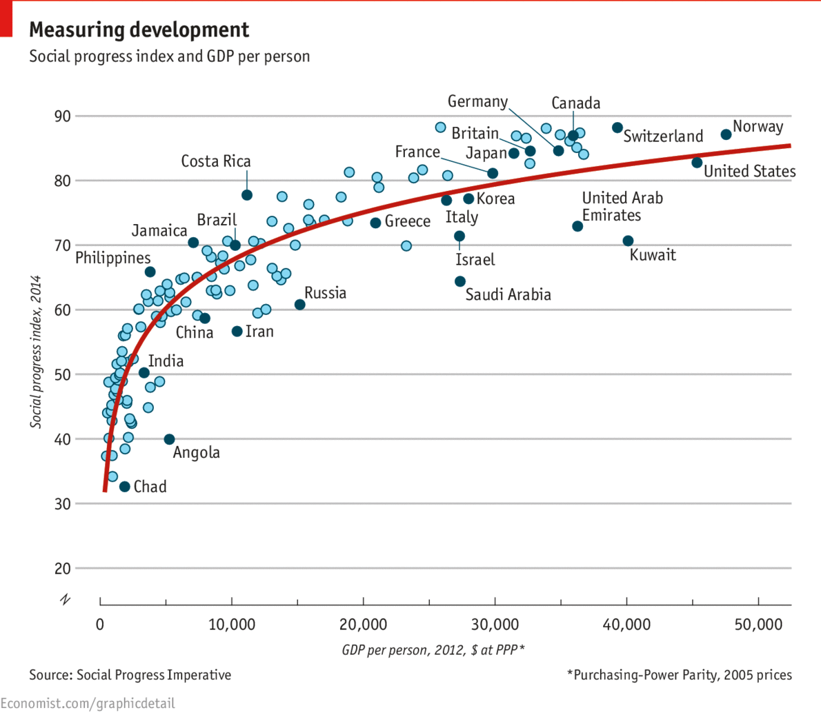
The chart shows the standard indicator of Gross Domestic Product per person as Purchasing Power Parity versus a new indicator of Social Progress. It makes the point that economic development is not necessarily a good measure of how well folk are living. Of course, very poor countries tend to have worse performance on the social progress index than do very rich countries (e.g. Chad versus Norway). But consider Angola versus the Philippines; Angola has slightly higher GDP per capita, but the Philippines are rated much higher on the Social Progress Index. Similarly consider Costa Rica versus Kuwait. Kuwait is much richer than Costa Rica, but the two have very similar measurements on the Social Progress Index.

Monday, April 07, 2014

What do Americans know about science.


I would much rather Americans understood more science than they do, but I wonder about articles such as this one which purports to describe that knowledge.

Here is the date provided by the article on question 7 of 10 ("The universe began with a huge explosion" for which the article states "Correct answer: True")


Current theory is that the universe began as a tiny thing composed of a "soup" of energy. It then rapidly inflated, essentially creating space. That inflation continues today, creating the appearance of galaxies flying apart. This has popularly been termed "the Big Bang" theory of the creation of the universe, and I suppose that "explosion" is a reasonable metaphor for what happened, but the creation of the universe was not an explosion in the sense we normally use the term. The original substance of the universe changed as space expanded and that substance expanding, cooled. But that doesn't seem to be an "explosion".

Another example: "10. Human beings, as we know them today, developed from earlier species of animals   Correct answer: True"


Apparently many Americans know that the theory of evolution exists and that it is accepted by science -- can in fact explain it reasonable well -- but do not accept evolution as it conflicts with their religious beliefs. Thus people have the knowledge of the theory of evolution that the question seeks, but the question does not test for understanding but for belief.

If you feel better believing that people everywhere know very little about science, I suppose you can go ahead and continue believing that. It probably doesn't do much harm to do so. But I am not sure that the questionnaire used by the NSF and described in the article provides a good index of such knowledge.

Sunday, February 02, 2014

A thought about indicators.


There is an interesting article in The Economist about indicators of the outcomes of medical treatment. It points out that data bases of medical records are allowing computation of multiple indicators of outcomes, which may lead to better decisions by patients and better management of health services.

The article cites a result from Germany, where 5 year survival rates after prostate surgery are similar for all clinics.
(G)ood health means more than life or death. Thanks to a study in 2011 by Germany’s biggest insurer, a sufferer now knows that the national average rate of severe erectile dysfunction a year after removal of a cancerous prostate gland is 76%—but at the best clinic, just 17%. For incontinence, the average is 43%; the best, 9%. 
My family and I belong to Kaiser Permanente, an HMO. The article states:
Kaiser Permanente, which operates in nine states and Washington, DC, pools the medical records for all its centres and, according to McKinsey, a consultancy, has improved care and saved $1 billion as a result.
It is always desirable to find the right index to provide the information for specific decisions. (For example, looking only at the public debt is probably not a good idea in deciding on fiscal policy. The debt to GDP ratio is probably better, and even better is to deal with a variety of indicators, including unemployment, rate of change of GDP, consumer confidence, business confidence, etc.) In evaluating health services, multiple indicators (and good indicators) are also important.

Tuesday, December 03, 2013

Corruption Correlates With Lack of Progress


Corruption around the world: Check out the results of the CPI 2013 http://t.co/pvBVnACThF
http://t.co/LXJfIVsbaN

Friday, November 01, 2013

The socio-economic correlates of political ideology


I quote the following description of the above map from the Pew Research Center's "Chart of the Week":
This map, part of an interactive series developed by Measure of America (a project of the Social Science Research Council) aims to summarize people’s well-being with a single indicator: the American Human Development Index. The darker a state is colored on the map, the higher its score..... 
(T)he American HDI uses four indicators to summarize three overarching goals: leading a long and healthy life (measured by life expectancy at birth), having access to knowledge (measured by school enrollment and adults’ educational attainment) and having a decent material standard of living (measured by median wage and salary earnings).
Compare the map with the presidential vote in 2012:
.wikipedia.org/wiki/Choropleth_map#sthash.1oi0b63D.dpuf
There is an obvious correlation. The blue states are more likely to have high values of the Human Development Index, the red states are more likely to have low values. Of course the 2012 blue states (California, New York, Florida, Pennsylvania, Illinois, etc.) are far more populous than the red states.

Those who vote democratic are more likely to be urban, relatively well off economically, longer lived and more educated than those in the red states. I suspect that this is another example of "where you stand depends on where you sit".

Saturday, May 11, 2013

From Estimating Probabilities of Ratings to Figures of Merit and Rankings


Two previous posts advocated a quantitative approach to peer review based on probability theory, Bayes rule and information theory. This post focuses on a figure of merit for ranking of submissions and a sequential process that seeks to maximize information where it is most needed deciding among submissions.
This is the third in a series of posts on quantitative approaches in reviewing scientific proposals and publications. The first two are:
A funding agency might have to select 150 proposals out of 1000 submitted  When I was involved in that kind of decision making, we seemed to find ourselves dividing the proposals into three groups on the basis of peer review:
  • Those so highly rated that they clearly were to be funded;
  • Those rated so low that they clearly were not to be funded;
  • A third group near the "cut off line" which might either be funded or not funded.
It doesn't much matter whether a proposal is ranked first or fifth in a set of 1000 if one is to fund 150; in either case it would be funded and the ranking is purely an internal aid to decision making. Nor does it matter much whether a proposal is ranked 700th or 800th as in either case it would not be funded. But it would matter a great deal whether it were ranked 150th or 151st. That difference might determine which of the two was funded and which was not, with a significant influence on the careers of the scientists involved.

Note however that the rating of proposals are subjective judgments. The rankings depend on estimates of what is likely to happen in the future if the research is funded. The judgment is made on the basis of a research proposal, and all research proposals are approximations. Moreover, reviewers are always less interested in the proposals that they are reviewing than in their own work, and are usually busy with other responsibilities. The uncertainty about the outcomes of the 150th and 151st proposals is almost certainly greater than the actual differences between those potential outcomes.

Still it is useful to have a defined procedure with quantitative indicators to formalize decision making. Such a procedure can be satisfying to both those managing the review process and those submitting proposals.
Consider the use of a figure of merit for proposals. I suppose that the standard approach would be to use the average of reviewer ratings for a proposal.

In the previously described procedure of sequential independent peer reviews, one might use the sum of the rating times its probability over all ratings for a given proposal. In the example, with ten possible ratings, they might be assigned values one through ten. The highest possible figure of merit then would be 10, were a proposal to have a 100% probability of the highest rating; the lowest possible figure of merit would be 1, were a proposal to have a 100% probability of the lowest rating. As described in the previous posts, such an indicator would incorporate more information on the reviewers and the correlations among ratings than would a simple average of ratings.

At any point in the review process, proposals could be rank ordered by their figure of merit.
  • Before the first reviews, all proposals would have the same figure of merit, since all would be characterized by the same a priori probability distribution of proposals over ratings.
  • After one review was received for each proposal, all proposals would have one of ten values of the figure of merit, since the first review could have only one of ten ratings. However, at that point the probabilities of the values of the ratings for the second review could be estimated. These would form something like a distribution around the actual rating received. The proposals could then (if desired) be shown on a graph. The X axis would be the rank order of the proposal; the Y axis would be the figure of merit and the possible figures of merit after the second round of reviews.
  • After the second round of reviews there would be more values of the figure of merit for proposals and narrower bands of potential values of the figure of merit. These too might be graphed.
  • Eventually the graph of the figure of merit versus rank order of the proposal would appear almost continuous.
At an early point in the process it would become apparent that no further reviews would be needed for some proposals. Those with very low estimated figures of merit could be eliminated from further reviewing since they clearly would not be funded; so too eventually some proposals would have figures of merit so high, and variance so low about their figures of merit that they would surely be funded. Evaluation effort could then focus more on the proposals still in doubt.

For example, while a couple of reviews might be required for all the proposals, perhaps a third review might be needed for only half of them, and further reviews for smaller and smaller portions of the field. Such a procedure would greatly reduce the demand on reviewers.

As a result the range of likely values of the figure of merit would be broader far from the competitive range (where relatively few reviews were used) and narrower in the competitive range (where there would be more reviews).

Thus, the effect would be to get more and more precision in the Figure of Merit for the proposals in the competitive range.

Note too, that in a final selection, one could look at the probability distributions of the ratings of the borderline proposals to be sure that there was a suitable high probability that the proposals being funded merited a higher rating than the proposals being rejected.

Saturday, April 27, 2013

A thought about consumer surplus and the measurement of national development.


Consider the standard diagram of supply and demand one might find in any textbook on economics.

The market clears when no consumer is willing to pay more than some seller is willing to sell the item in question. The consumer surplus is the total of the value of materials purchased by the consumers in excess of the price that they pay for what they bought. The producer surplus is the total of the amounts received by sellers over that which they valued that which they sold.

Now consider what happens when it becomes possible to produce at lower unit costs.


There is a shift in the supply curve, and assuming that there is no shift in the demand curve, the consumer surplus increases. That is, all the people who would previously have purchased the product at the higher price still purchase it, but at a lower price -- the surplus for each presumably increases. In addition, there are new buyers who now also receive a consumer surplus.

The contribution of the market transactions to the GDP are the total quantity sold times the price at which it is sold. Depending on the shape of the demand curve, the improved efficiency of production may increase or decrease the contribution to GDP. In either case, more sales at lower prices increase consumer surplus.

Water Supplies

In poor countries, drawing water is a big problem. People spend a great deal of time going to streams or pumps and carrying heavy loads of water back to their homes for drinking, cooking and washing. Of course, this doesn't enter the calculations of GDP since the people drawing water (usually women or children) are not paid for their labor.

When water is piped to the home, it becomes available at nominal cost. The labor that was formally used to carry water is freed for other work (or school) and there is only a small cost in keeping up the system. Water use goes way up. People are able to use more water. Indeed, the burden of disease goes down. People can not only drink more, use more water in cooking and in washing dishes and themselves, they can use water to wash floors and water plants. Consumer surplus goes way up. However, it is not measured in any national accounts.

Can We Measure Consumer Surplus?

I suspect that the true measure of progress is more related to the accumulation of consumer surplus than to the growth of GDP. How are we to measure that progress?

One measure is probably the extension of life expectancy. The longer we live, the more time we have to enjoy life.

One problem is that we have decreasing hedonic returns to scale. The more food we have, the less we value increasing amounts of food; indeed, if we have more than we can eat we have to spend time and effort disposing of the waste food. We are willing to pay more for better food, and to some degree we are willing to pay more for more nourishing food. People, as their incomes increase, spend more on meat, eggs and dairy products. Unfortunately, we also pay more for foods that are bad for us.

Another problem is that there are many aspects of life that we enjoy but don't pay for. Think of leisure, learning and enjoyment of family life.

Maslow's Needs Hierarchy


Perhaps we could develop a measure of development based on Abraham Maslow's ideas of a hierarchy of needs. Some measures that would allow plotting of how successfully the population of a country was fulfilling each layer of needs might be a much better (multidimensional) measure of development than per capita GDP.

Saturday, April 13, 2013

The Revolution 2.0 Index: Where Will The Next “Arab Spring” Occur?


Richard Heeks has created a Revolution 2.0 Index (see chart below). It is each country’s Outrage score minus its e-Control score.  A low overall score might derive from a country being relatively democratic, creating limited head of steam for regime change (e.g. India) or because cyberspace is so controlled (e.g. Cuba, China).  Conversely, high scores typically arise in countries where political freedoms are compromised but Internet freedoms are not (yet).


Tuesday, March 12, 2013

GDP is not a great indicator of development


Yesterday I wrote questioning whether we need a better measure of progress than growth in the GDP. I was focusing on the growth of consumer surplus as compared with the cost of goods and services.

I suppose the classic example is in health. It is clearly better for people to be healthy than for them to be sick. On the other hand, healthy people will tend to buy only relatively inexpensive preventive health services to keep themselves healthy, while sick people tend to buy much more expensive curative and palliative services. Thus more sickness leads to higher GDP, more health to lower GDP.

I was just listening to Jeremy Grantham on the Charlie Rose show. He pointed out that our society runs on fossil fuel, fertilizer, and some other minerals. If the price of those natural resources goes up, say because they are more difficult to extract, then it appears that GDP is going up. This is in part because they are part of the cost of producing all the other goods and services. But the benefit of a barrel of oil that now costs $100 is no greater than the benefit of a $16 barrel of oil many years ago was to that economy. The Chinese are competing in world markets for fossil fuels and other natural resources, and the increased demand is increasing prices (as is the decreasing supply). That fuels growth in the GDP, but not improvement in the quality of life.

On the other hand, increasing energy efficiency (say by insulating buildings better or using energy efficient lighting) decreases energy use without decreasing quality of life. The rapid growth in renewable energy and its substitution for energy based on fossil fuel similarly tends to keep quality of life high while cutting back on the rate of growth of GDP.

Grantham points out that population growth has contributed to growth in GDP but that a smaller population is better for the environment and the conservation of natural resources. We must keep human population within the carrying capacity of the earth, and indeed within bounds that will allow a decent standard of living.

Grantham is famous for predicting stock market bubbles, and his philosophy seems to suggest that we may be living in a centuries long "bubble". The technological revolutions that have fueled our economic development have literally been fueled by the exploitation of fossil fuels built up over millions of years, and we are depleting those fossil fuel resources while pouring greenhouse gasses into the atmosphere. If we drive climate change and environmental degradation too far while depleting natural resources and overpopulating the earth, the quality of life will necessarily deteriorate.

I have a feeling that there are great gains to be had in quality of life through the right kind of education. Schooling children and young adults does cost money for schools, teachers and supplies. At some point, however, people can move into lifelong learning modes that are beneficial to all aspects of life, but that don't require schools. The more that people learn, I suppose that they can be more productive as workers, better citizens, more able to protect their own health and that of their families, etc. If their schooling has given them the enthusiasm to continue self education, the social network to share learning with others, and the tools to learn for the rest of their lives then there is great benefit with little cost.

Food and agriculture is another area where focus on GDP may have perverse effects. We live in a society that eats too much, and too much of the wrong things. There is an epidemic of obesity. We eat too much meat while data show that a Mediterranean diet would be better for our health; that diet does not seem to reduce the quality of life for the Greeks and Italians as compared to us fat Americans. Obviously, producing and distributing more food increases the GDP; so does producing the high fat, high sugar processed foods that contribute to health problems.

My point is that "the good life" is different than "the affluent life". It would be better to focus on fundamental values and seek a life style that maximizes them than to focus on income and wealth, maximizing them while sacrificing other (more important) values. A focus on increasing GDP in a society with high rates of school drop outs, poor health statistics, high rates of crime and addiction, huge numbers of people in jail and other social problems is not the way to progress.