 |
| Source: The Economist |
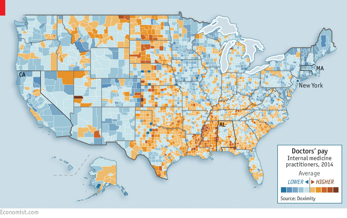
The map, based on pay data from more than 18,000 internists, shows striking geographical disparities. Rural medics make more, because few doctors want to live in the boondocks. Pay is lower in fashionable neighbourhoods: a doctor of general medicine in New York typically earns 64% less than his peer in Alabama. The lowest pay is in Massachusetts, which has four medical schools and a surplus of stethoscope-slingers.
Where Working Women Are Most Common
 |
| Source: The New York Times |
I quote from the article in The New York Times from which I drew this map (the source is an interactive graphic):
The towns and counties where the lowest share of men between the ages of 25 and 54 are employed tend to be some of the tougher places in the United States to live, including Appalachia, Northern Michigan, the Deep South and the interior Southwest.
The places with low levels of female employment have a lot of overlap with these high-poverty places, as an Upshot analysis of census data shows. That’s hardly surprising: Lack of employment has a strong and obvious correlation with poverty. Yet the geographic patterns of female work also have more nuances than the male patterns.
Female employment rates are relatively low in some fairly affluent areas, including Utah and other heavily Mormon areas — as well as on the Upper East Side of Manhattan. The East 80s and the suburbs of Salt Lake City may be very different places, but both have local cultures with a bent toward stay-at-home parenting, which still is far more likely to be done by mothers. In this way, they are extreme examples of a national trend: a modestly increased interest in full-time parenting in recent years.I was struck by the deep South, where jobs are scarce, but doctors make relatively high rates of pay. Doesn't seem fair does it?

No comments:
Post a Comment