Generic Lorenz Curve

The Gini coefficient can then be thought of as the ratio of the area that lies between the line of equality and the Lorenz curve (marked A in the diagram) over the total area under the line of equality (marked A and B in the diagram); i.e., G = A / (A + B).Thus the Gini coefficient in theory varies from zero to one. the larger the value, the more unequal the distribution over the population.
Here is how the Gini Coefficient has evolved in the United States since World War II:
 |
| Source |
As you can see, the distribution of income became more and more equal after the war, but reversed course and began a long process of becoming less equal from about 1975. As the One Percent appropriated more and more of the income in the United States to themselves, we have seen a rise of Occupy Wall Street and the Tea Party.
I suspect that Americans are upset that most Americans are not doing better economically as time goes on, and that their hopes for the next generation will not be fulfilled. On the other hand, there is some anger at the very rich who seem to be using their political and economic power to bias the playing field to further enrich themselves.
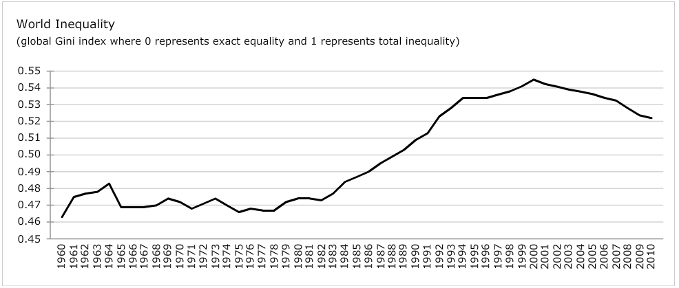
Now consider the evolution of the Gini coefficient for the world's entire population:
 |
| Source |
I suspect the wide spread envy and anger of the One Percent in the United States is mirrored by wide spread feelings for the affluent in the United States in the rest of the world.
GDP per capita World Map
 |
| Source |
No comments:
Post a Comment