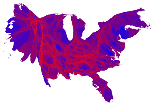
Mark Newman of the Department of Physics and the Center for the Study of Complex Systems at the University of Michigan has produced a great set of maps showing how Americans voted in the presidential election this year.
The map shown above shows results by county. The area allocated to each county is not its land area but rather its population. Dr. Newman has kept the overall shape of the country in this projection more or less comparable to the projections we are used to seeing.
He has used red, blue, and shades of purple in between to indicate percentages of votes for Republicans and Democrats.
A picture really is worth 1000 words.
No comments:
Post a Comment