Evolution of the U.S. GDP
 |
| Source |
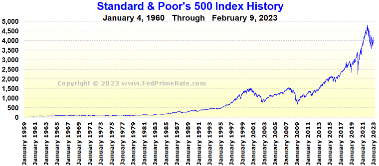
Evolution of the S&P 500: 1959 to 2009
 |
| Source |
 |
| Source |
As I understand it, one of the classic signs of a stock market bubble is when stock prices increase more rapidly than the Gross National Product for an extended period. That was what happened in the 1990s, followed by a drop of the index value to its long term trend. It also looks like that was what happened prior to 2008. There was a recession in the aftermath as would be consistent with the the bursting of a bubble.
The U.S. market indices have now returned to a region similar to that prior to the financial crisis of the late 2000s, and so too has the GDP. It rather looks like the rate of GDP growth trend has returned to its long term trend after several years of more rapid growth than might have been expected.
The volatility of the S&P index seems high at the moment, but the ratio seems consistent with the long term normal value.
 |
| Source |
The interest rates are currently being held low by the Federal Reserve, meaning that returns on bonds are low. That leads to high P/E ratios on stocks as well.
No comments:
Post a Comment