American ancestry by county
 |
| Source: "40 more maps that explain the world," The Washington Post |
This map, which shows the dominant ancestry in each U.S. county, is a wonderful show of American diversity and a living museum of America's history of immigration, voluntary as well as forced.
Percentage of individuals living in poverty, by county, 2000
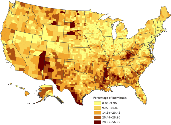 |
| Source: "The Topography of Poverty in the United States: A Spatial Analysis Using County-Level Data From the Community Health Status Indicators Project" |
What do you suppose the socio-economic mobility is for a young person of one of these ancestries, coming from a very poor family in a county with lots of poor people? Do they have equal educational services? We know that education has been a key to individual mobility in America. Do they have role models living locally who have succeeded economically?
No comments:
Post a Comment