 |
| Source: The Economist |
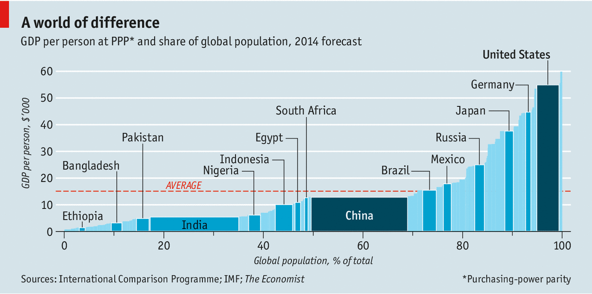
As it is easy to see, the countries are ordered on the graph by increasing per capita GDP. These estimates made by a World Bank project indicated that the United States produces more goods and services than any other country, followed by China, India, Japan, Germany and Russia in that order. Thus India with a fairly low GDP per capita but a very large population is estimated to produce more than Russia with a much higher GDP per capita but a middle size population.
I suspect that the Russian forecast may be reduced as a result of the sanctions and capital flight in recent weeks.
No comments:
Post a Comment