 |
| Source |
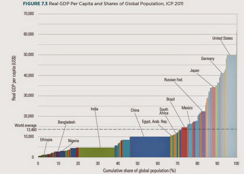
The vertical axis shows per capita GDP.
Thus the area for a country is proportional to per capita GDP times the country's portion of the world/s population. You could change the horizontal scale by multiplying by the global population, and then the area for each country would be per capita GDP times the country population, or the GDP for that country. Thus the relative areas in the graph for countries are proportional to their relative shares of global GDP; China's wide and short block has about the same area as the tall, narrow block for the USA.
No comments:
Post a Comment